
devcol.net
VitePress, Vue, GSAP, GitHub Pages · AI-assisted (Claude) · GitHub: devcol-site
This is the site you're reading. It holds the DevLog, the project write-ups, and the study notes, and I treat it as a project of its own. I decided what it should contain and how it should behave, Claude wrote most of the code, and I checked the result in the browser and sent it back until it was right.
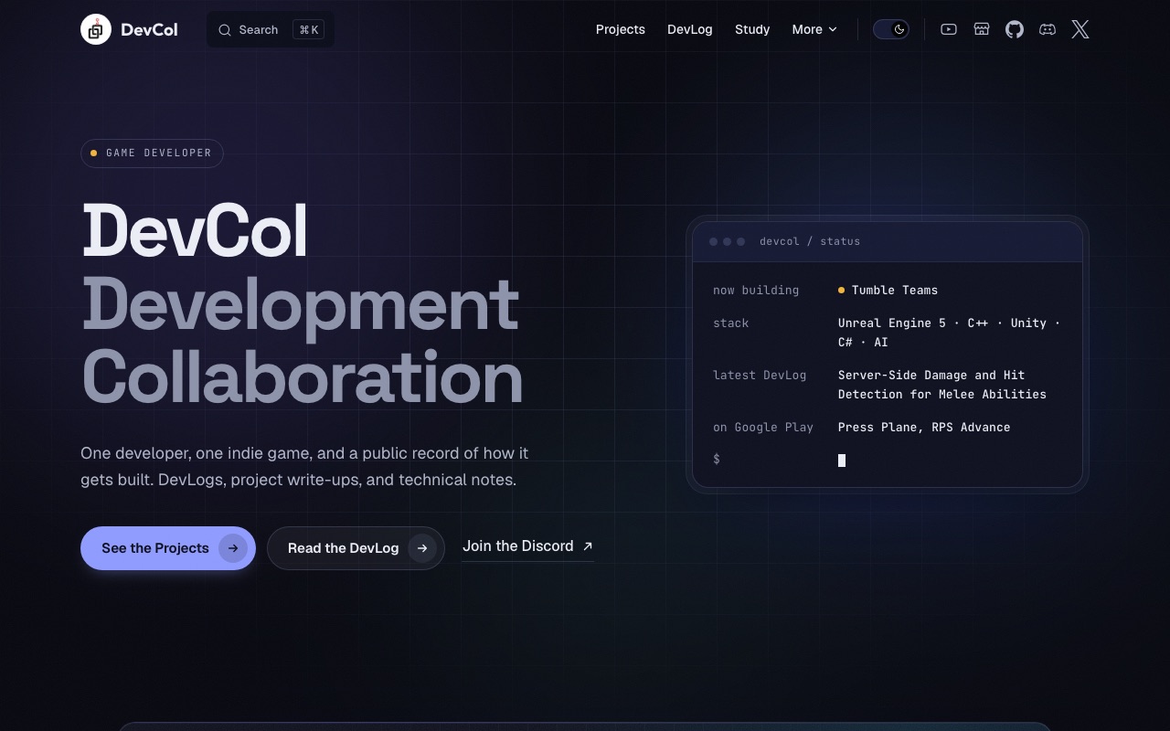
This page covers how the site is put together, how the home page fills itself in from the DevLog, and how the October 2026 redesign went, including the design skills I used and the things that broke.
What it's built with
- VitePress generates the pages from Markdown. The home page, the navigation, and the footer are a custom theme written as Vue components.
- GitHub Pages hosts it. A GitHub Actions workflow runs
npm ciand the VitePress build on Node 24, then deploys on every push tomain. The repository has an.nvmrcso my local Node version matches the one the workflow uses. - Cloudflare holds the domain and DNS. GitHub issues the TLS certificate. The domain, about $12 a year, is the only recurring cost.
- Fonts (Space Grotesk, Geist, JetBrains Mono, and Outfit for the logo text) are installed as npm packages and bundled with the site instead of loaded from a font service.
- GSAP and its ScrollTrigger plugin drive the scroll effects. They're loaded only on the home page, after the page is already on screen, so the other pages don't download them at all.
The sitemap is generated at build time, a robots.txt points to it, and search is VitePress's built-in local search.
How the home page fills itself in
Most of the home page isn't typed in by hand. The post, project, and study note counts on the cards, the build track for the game I'm working on, the "latest DevLog" line, and the date in the rotating label at the top all come from files in the repository when the site is built.
The source is the DevLog index, docs/blog/index.md. It already listed every post under a heading for its project, newest first, so I kept that format and made it the data:
## Tumble Teams

- 2026-10-03: [Server-Side Damage and Hit Detection for Melee Abilities](./2026-10-03-tumble-teams-damage-and-hit-detection)
- 2026-10-03: [Why Mixamo Animations Broke on My Character...](./2026-10-03-tumble-teams-mixamo-retargeting)
A VitePress data loader reads that file line by line at build time. A ## line starts a project group, and a - date: [title](./slug) line adds a post to it. For each post it also reads two fields from the post's own frontmatter: description, and an optional track label. Full titles like "Why Mixamo Animations Broke on My Character, and the Retargeting Pipeline That Fixed It" are too long for the build track, so each Tumble Teams post now has a short label such as track: "Mixamo retargeting pipeline". A post without one gets its title cut at a word boundary.
Which project counts as "now building" is one setting in the theme:
export const nowBuilding = 'Tumble Teams'
export const nowBuildingTags = ['Unreal Engine 5', 'Multiplayer']
The name has to match a heading in the DevLog index. When I move on to the next game, I add a new heading to the index, change these two lines, and the home page follows. The project count comes from the same list that draws the Projects page, and the study note count is the number of Markdown files in the Study folder.
The redesign
I had installed a set of design skills for Claude Code and wanted to use them to upgrade the site's design. Before this, the site had a cream-and-orange light mode and a black-and-lime dark mode, a status card in the style of a terminal, and four numbered cards on the home page. I liked several things about it, mainly the light that follows the mouse across the cards and the small reactions when you hover over or press a button, and I wanted to keep those.
The skills I used
A skill in Claude Code is a packaged set of instructions for one kind of task. These are the ones that ended up shaping the site:
| Skill | What it's for | Where I used it |
|---|---|---|
impeccable | General frontend design: layout, type, color, critique, polish | Draft A, Draft F |
industrial-brutalist-ui | Swiss print grids mixed with a technical-document look | Draft B |
minimalist-ui | Calm editorial layouts in warm monochrome | Draft C |
emil-design-eng | Emil Kowalski's approach to UI polish: hover, press, and animation details | Draft C, Draft E, the final merge |
gpt-taste | Large type, bento grids, and GSAP scroll effects | Draft D, Draft E |
animate | Deciding whether and how something should move, then building it | Draft F |
redesign-existing-projects | Auditing an existing site before upgrading it | Draft G |
high-end-visual-design | Spacing, shadows, and card details that make a page look finished | Draft G |
Each draft was a single HTML file with the real posts, projects, and images from this site, built by its own Claude agent so several could be made at once. I compared them as screenshots and in the browser, wrote down what I liked and didn't, and the next round was built from those notes.
Round 1: four directions
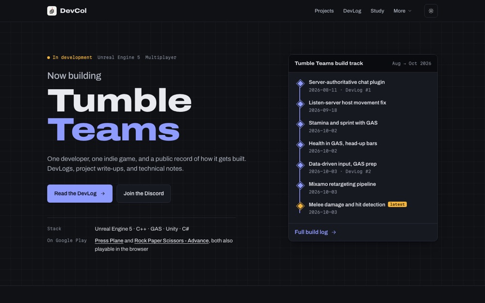
A treated the site like a game build in progress: "Tumble Teams" as the headline, and a build track drawn like the Sequencer timeline in Unreal Engine, with one diamond per DevLog date.
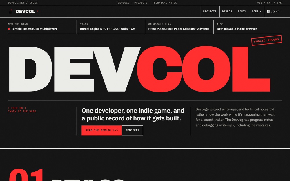
B went the other way: a giant "DEVCOL" in black and red, DevLog posts numbered like log entries from 007 down to 001, and projects laid out as spec sheets.
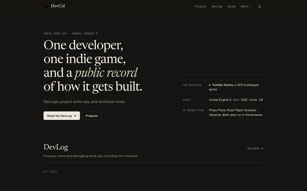
C was a quiet reading layout with a serif headline and the DevLog grouped by month right under the first screen.
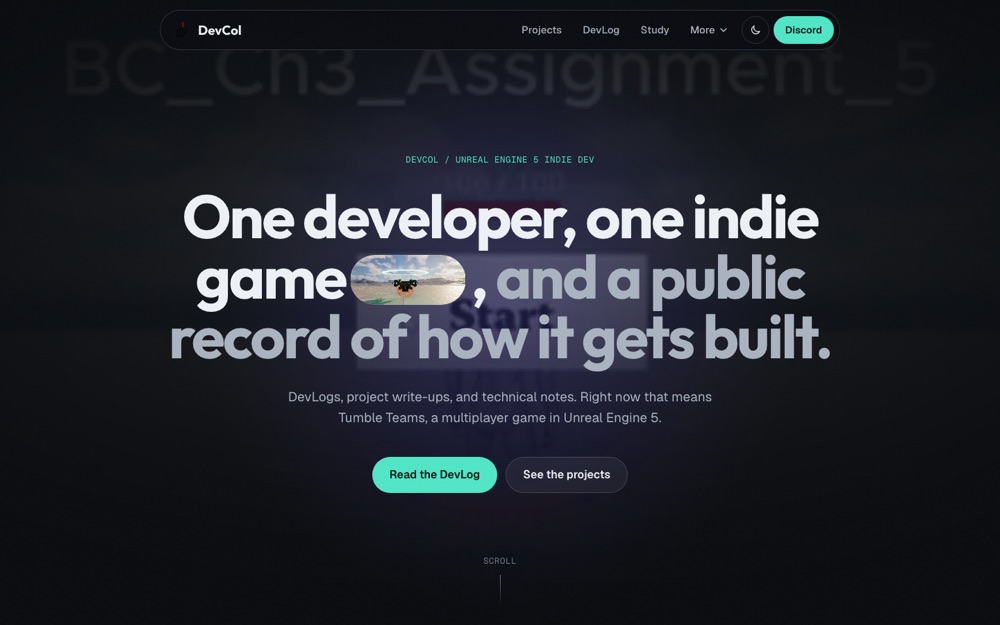
D had a gameplay video behind a huge centered headline, a small video set inside the headline itself, project cards that stack on top of each other as you scroll, and words that light up one at a time.
B was too much for me, though I liked its red. My logo is black with a red hook, so a little red fits. C was too plain. A felt modern and clean, and I liked how the card borders react on hover. D was my favorite because of its scroll effects. The video behind its headline was the weak part: it opened on a title screen that reads "BC_Ch3_Assignment_5", which you can see in the screenshot above.
Round 2: combining the parts I liked
The next three drafts each started from a different base and borrowed from the others: E kept D's structure and scroll effects, F kept A's layout and added D's motion, and G started from the old site and upgraded it.
I had asked for red to be used sparingly, and the drafts came back with almost no color anywhere, just dark pages. That wasn't what I was after. The colored glow behind the old site's home page was one of the things I liked about it. The drafts were redone with color in the background: warm reds and amber for E, blues and cyan for F, coral and violet for G.
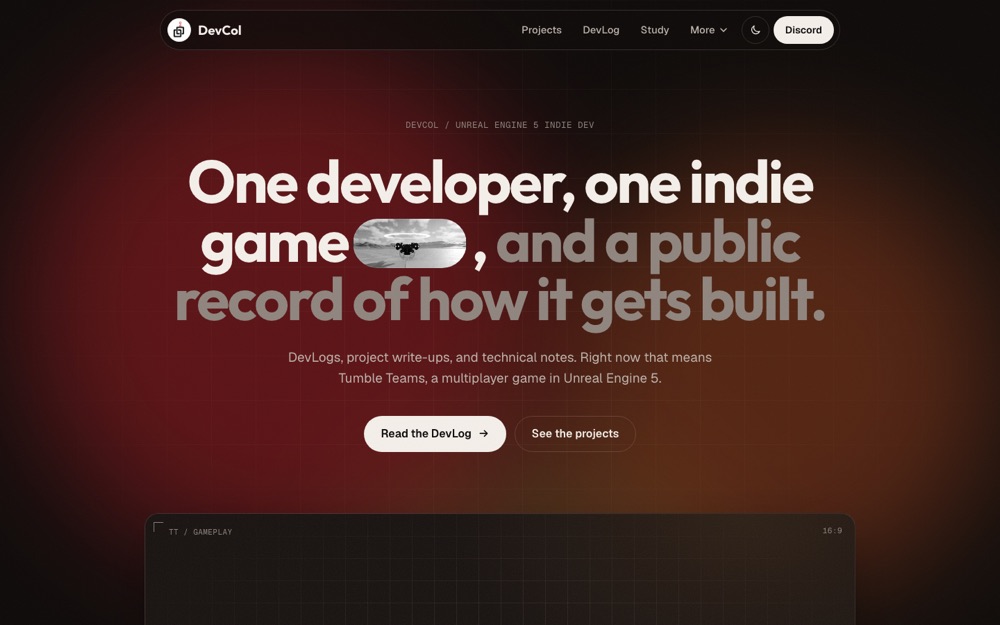
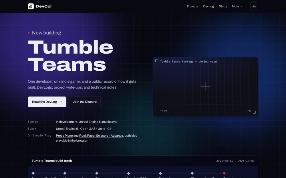
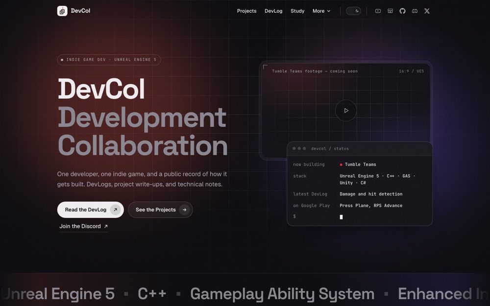
Draft G began with an audit of the old site, and its three main points were fair. The light and dark modes looked like two different brands. The four cards of the same size and style in a row were a very common layout. And the accent color was on almost everything, so nothing stood out.
Round 3: one merged design
I didn't pick one draft. The final design takes:
- from G: the page structure, the first screen with the terminal status card, and the featured projects slider with its category filter
- from F: the blue palette (mixed with several glow colors the way G did it), the project cards with corner marks that react on hover, and the build track
- from E: the video frame that grows as you scroll to it, the footer layout, and the font used for "DevCol" in the logo
- from A: the "Follow the build on Discord" band near the end, and the "In development" label with its pulsing dot
After that came a long list of small changes. The colors on the first screen were too strong, so I turned them down. I tried A's first screen in place of G's, preferred the previous one, and moved A's version further down the page as its own section about Tumble Teams. The numbers on the four cards became small icons with real counts. The build track was flipped so the newest post is on top. The last section changed from "Ask about the build" to "Contact us" and now points to the Contact page. The logo wobbles a little when you hover over it, the menu has a highlight that slides between links, and the social icons turn their own brand colors on hover.
D's video-inside-the-headline idea came back as a section in the middle of the page: "Show the work while it's happening." The line comes from a sentence on my About page. The video behind it is a calm stretch of my Pawn project clip, slowed to half speed, darkened, and slightly blurred, and the small one inside the text is a few seconds of running gameplay from another project.
In the end the accent color is a blue, amber marks things that are in progress, and the only red left on the page is the hook in the logo.
Problems along the way
A title screen in the background video
The Game Loop project video starts with six seconds of menus and a title screen. The fix was to never play those seconds: each video now has a start and end time, and a small script jumps back to the start time whenever playback leaves that range. The project cards begin at 8 seconds, and their still preview images were replaced with a frame from the actual gameplay.
That broke on my computer before it worked. The basic Python file server I used to preview the drafts doesn't support HTTP range requests, so the browser couldn't jump into the middle of a video and the clips just sat there. A small server with range support fixed the preview. GitHub Pages already supports range requests, so the live site was never affected.
Stuttering around the projects
Scrolling stuttered near the Featured Projects section. Turning effects off one at a time showed the cause was the stacked project cards. As the last card shrinks with the scroll, GSAP's default setting kept switching its transform between 2D and 3D, and each switch made the browser redraw a large rounded card with a shadow from scratch. Forcing 3D transforms on every scroll-linked animation, and marking elements for the GPU only while their animation is active, fixed it. In a scripted scroll through that part of the page in headless Chrome at desktop width, rasterization time dropped from about 57 ms to 17 ms. I also removed a few blur filters that cost a lot and looked the same without them, and videos now play only while they're on screen.
Animations that outlive the page
VitePress swaps pages without a full reload. Without cleanup, the scroll animations created on the home page would keep running after you click to another page and be created a second time when you come back. So all home page animations are created in one group that is torn down when you leave. Going from the home page to Projects and back three times leaves the same number of active scroll triggers each time.
Smaller ones
- The class name for the logo text,
.brand, also matched VitePress's own primary buttons. The hero buttons picked up the logo font and spread apart. Renaming the class fixed it. - The description at the top of this very page contained a colon ("How this website is built: ..."). In YAML frontmatter an unquoted colon breaks parsing, and the whole build failed until I put the text in quotes.
- The deploy workflow uses Node 24 while my computer was on Node 22. The build happened to work on both, but I added the version file so the two can't drift apart quietly.
The first DevLog post covers the earlier problems from when the site first went up: a broken itch.io icon, an expired Discord invite on six pages, and itch.io embeds that only showed a preview card.
What's next
The video frame under the first screen still says "Tumble Teams footage · coming soon". It will get real gameplay footage later. A Korean version of the site is planned for later, under its own /ko/ path.